
Project Plan and Detailed Timeline
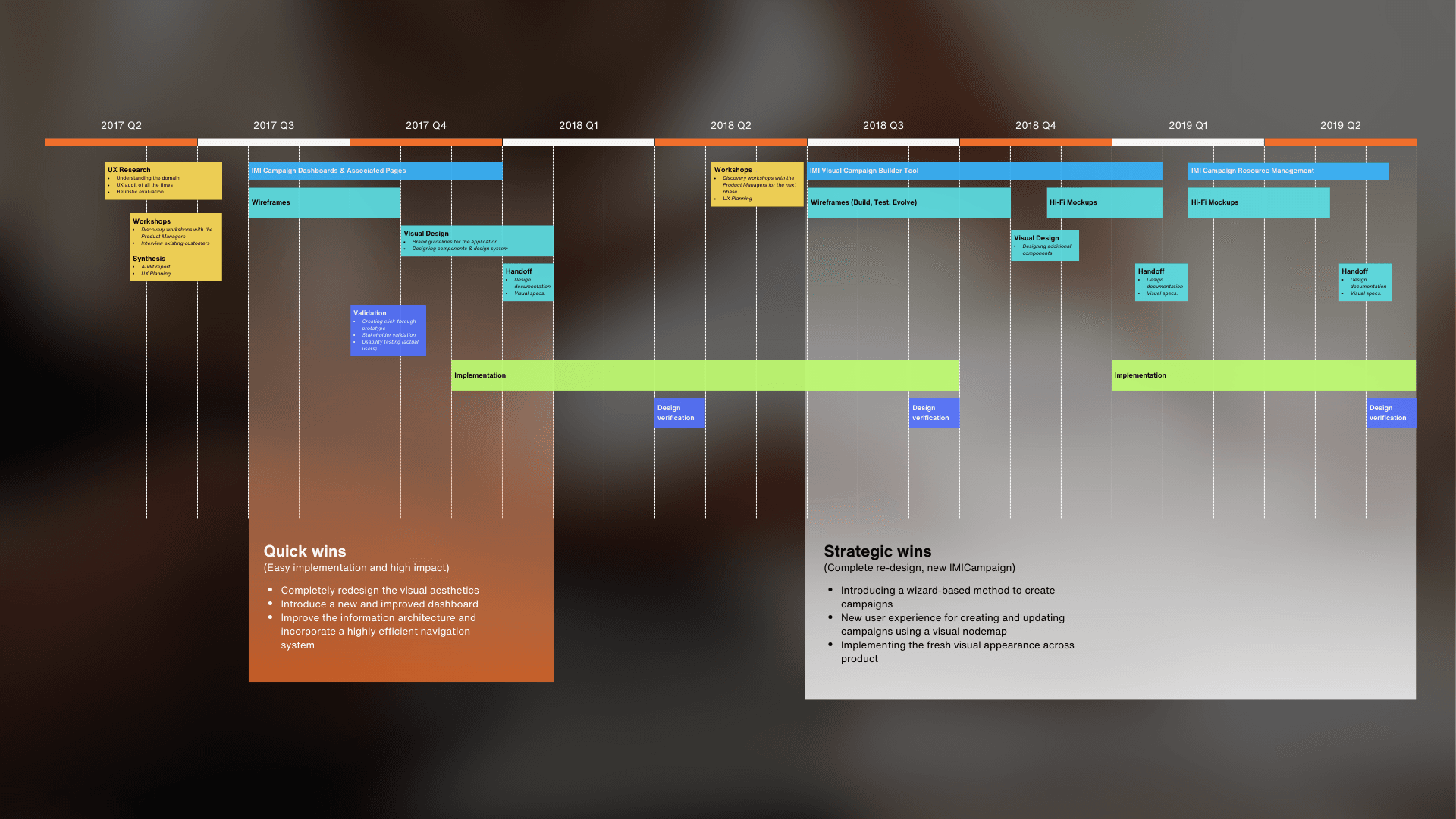
Project timeline covering all phases from discovery to handoff
Problem Space
What are the core functions of the Campaign Management Tool?
Cross-channel deployment Trusted with millions of communications across SMS, App Push, MMS, and Email.
Mobile-first capabilities Optimised campaigns for smartphone engagement throughout the customer lifecycle.
Priority Campaigns Famed for creating one of the most engaged customer bases across various domains.
This tool is an integrated campaign management system. It offers a way for enterprises to instantly innovate, switching from poorly-integrated disparate systems to joined-up cross-channel communications that use the latest mobile-first capabilities. From location-aware messaging to instant access to new mobile channels, IMIcampaign's features work together to increase campaign ROI and improve campaign CX.
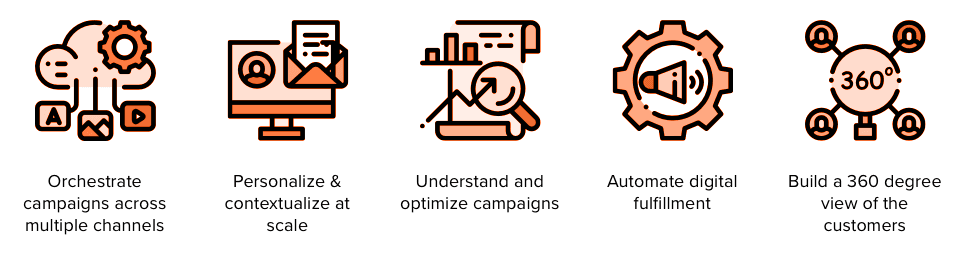
IMIcampaign product overview — channels, capabilities, and integrations
Product Analysis and User Research
Product Manager
Strategic product direction and roadmap decisions.
Account Managers
Client relationships and requirement translation.
Operations Staff
Day-to-day platform execution and management.
Project Managers & Lead Developers
Technical implementation and cross-team coordination.
Research
Stakeholder Consultation & Module Analysis
To gain a comprehensive understanding of the existing platform's limitations, we initiated the project with a deep-dive product analysis centred on stakeholder interviews. By speaking directly with various members of the team across the organisation, we captured qualitative insights that defined our path forward.
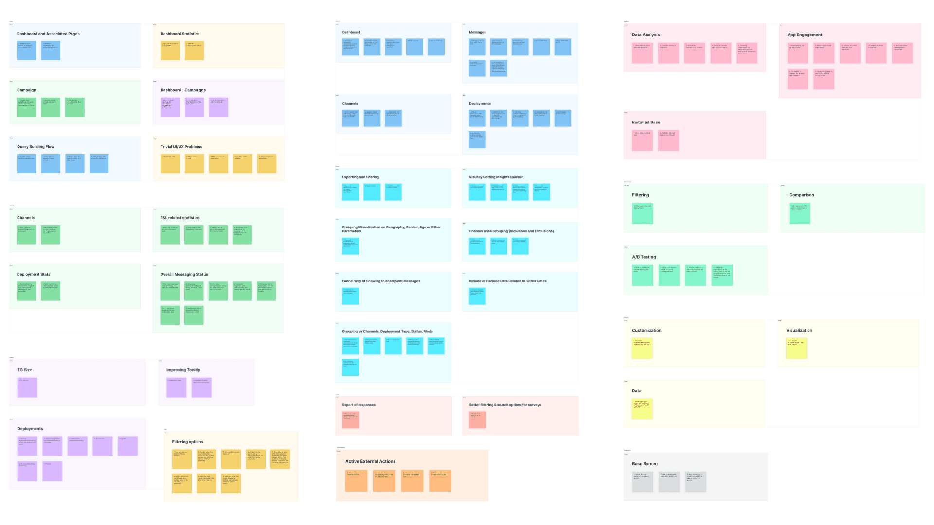
Problem areas mapped across all modules
Synthesis
Synthesizing the Findings
By documenting insights section-by-section, we moved beyond anecdotal feedback to create a structured list of requirements. This process of connecting with real-world users and internal experts validated the need for a transition toward a more visual, data-driven, and streamlined interface.
Dashboard
Dashboard — User Segmentation & Goals
Primary User Goals
Executive Oversight (The 'Fish Eye' View) High-level performance snapshot across P&Ls and Campaign Groups to assess health at a glance.
Performance Measurement Tracking of core metrics including Campaign Statistics, User Engagement, and ROI to justify spend.
Drill-Down Capability Move from top-to-down statistics — macro trends into granular, row-level data.
Multidimensional Analysis Filtering and grouping by marketing channels and date ranges to identify seasonal trends.
Campaign Management
Campaign Management System — Goals
Campaign Lifecycle & Governance
End-to-End Management Comprehensive tools for creation, editing, and ongoing management of marketing initiatives.
Hierarchical Visualization Clear visibility into Campaign Groups, Primary Campaigns, and Follow-up Campaigns.
The 'Who, What, When' Framework Standardised interface to define audiences, content, and scheduling with full flexibility.
Organizational Alignment
Unified Campaign Calendar Single source of truth aligning teams around a shared schedule.
Global-to-Local Unification Synchronize campaigns across levels to deliver a consistent customer experience.
Content & Asset Enablement
Integrated Asset Library Centralised management for rich media — templates, images, video, and audio.
Creative Streamlining Simplified uploading and association of assets directly with campaign steps.

User Personas
We zeroed down on these two personas because they represent the two critical pillars of the campaign management lifecycle: strategic oversight and operational execution. By focusing on Aaron and Marie, the redesign addresses the entire value chain — from data-driven decision-making to the technical rollout of content.
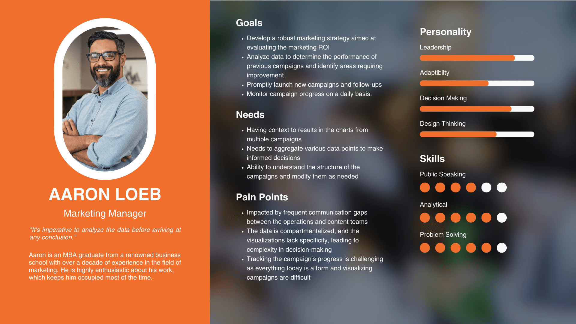
Aaron Loeb
Strategic StakeholderCMO · Focus on brand alignment and organisational goals. Needs high-level aggregated visualisations that clearly define ROI. Aaron's persona highlights the need for a dashboard that moves away from compartmentalised data.
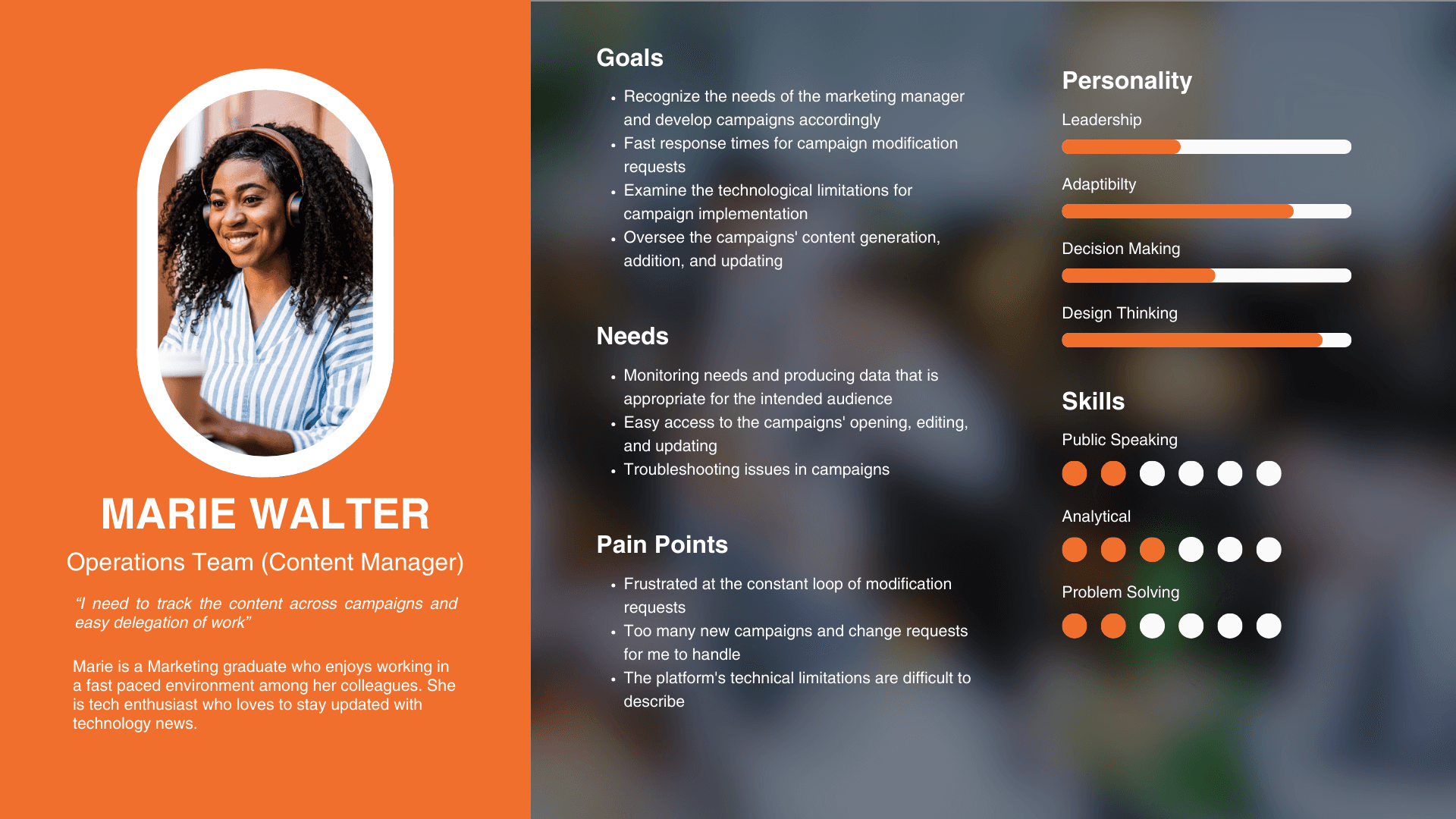
Marie Walter
Power UserCampaign Manager · Represents the operational executor. Her inclusion ensures the redesign solves 'boots on the ground' issues — friction from constant modification requests and the technical limitations of the existing form-based system.
Ideation and Solutioning
Approach
Solution Approach
This structured, iterative design process bridges the gap between complex technical requirements and the end-user's mental model. By moving through stages like Opportunity Areas and Affinity Mapping, the team synthesised scattered stakeholder feedback into a cohesive strategy before any code was written.
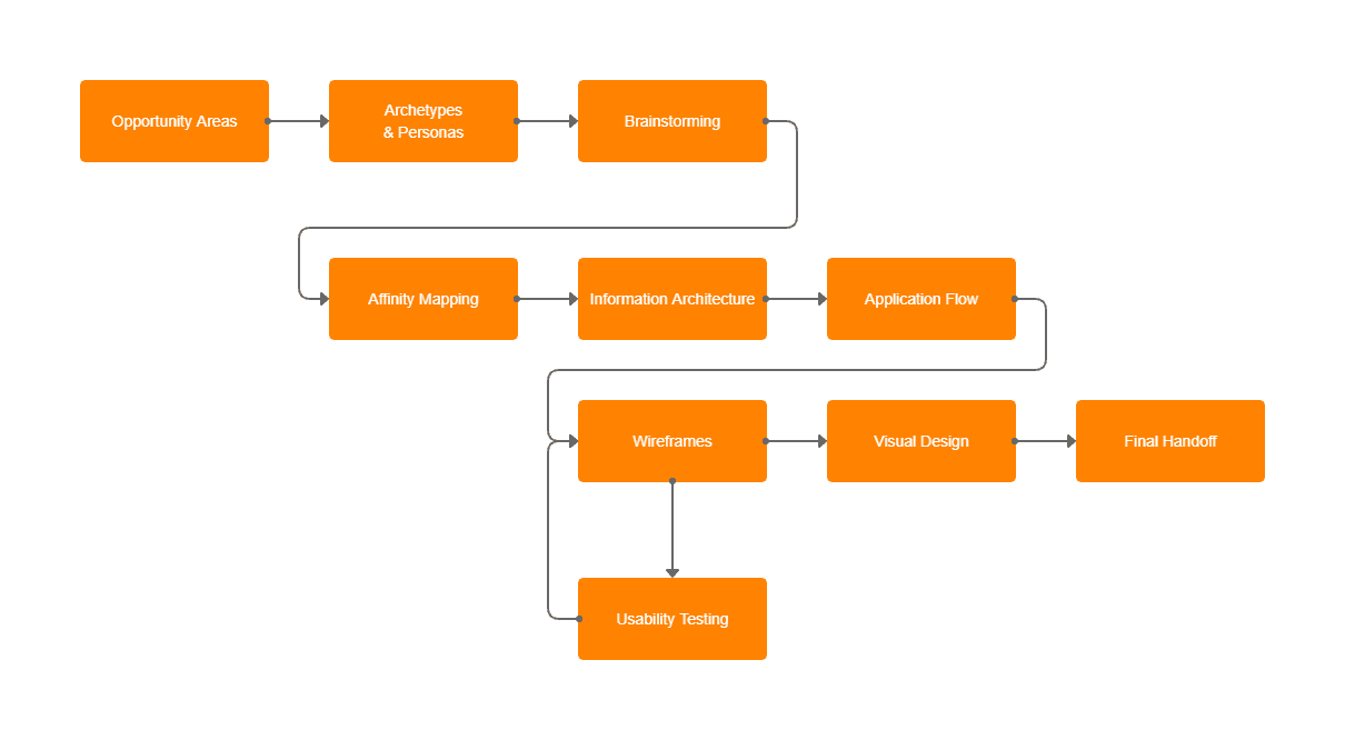
Design process — Discovery → Opportunity Areas → Ideation → Wireframes → Testing → Visual Design
Why This Process Was Required
Managing High Complexity The shift from form-based to node-based required deep IA and application flow mapping.
Stakeholder Alignment Early brainstorming and wireframes acted as co-designing tools, keeping stakeholders engaged.
Risk Mitigation Usability testing loops identified bottlenecks early, preventing costly rework.
Consistency at Scale A defined process produced a styleguide enabling pixel-perfect component implementation.
Information Architecture
Information Architecture
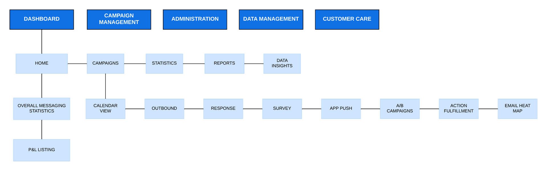
Existing IA — legacy system structure
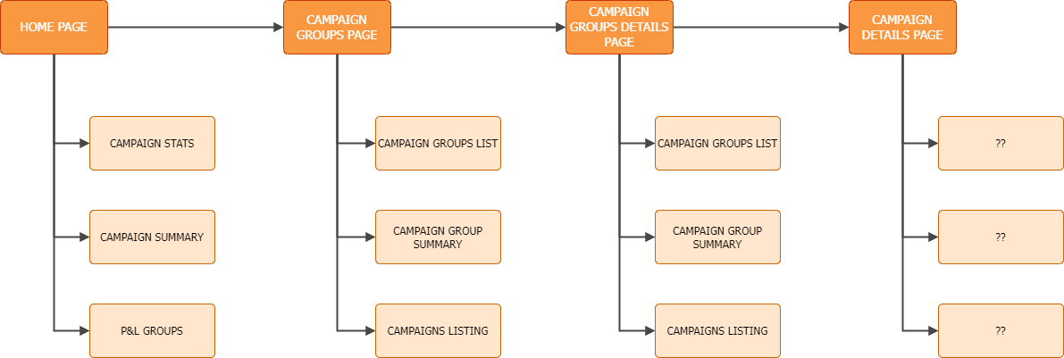
Redefining: Initial iteration after card-sorting exercise
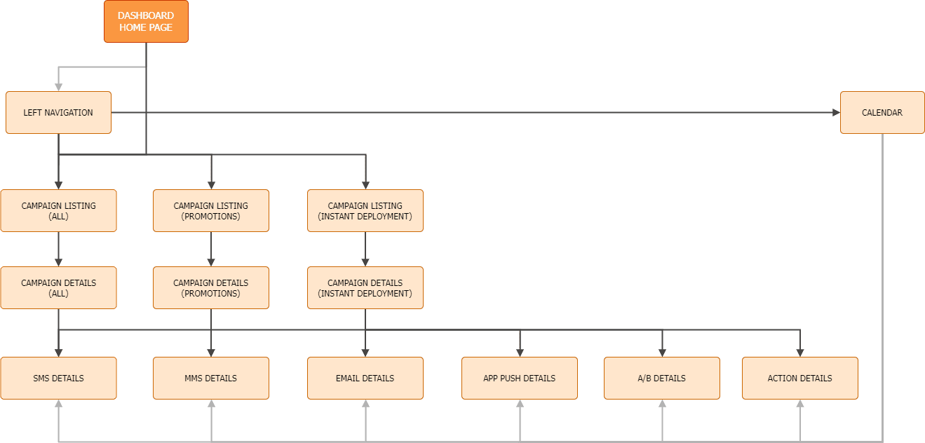
Redefining: Final iteration — detailed IA
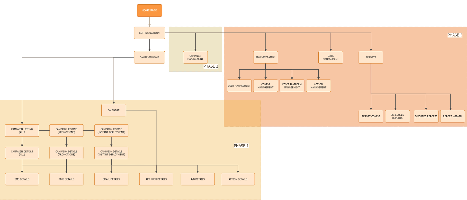
Application structure derived from final IA
Dashboard
Re-designing the Dashboard
Before
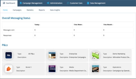
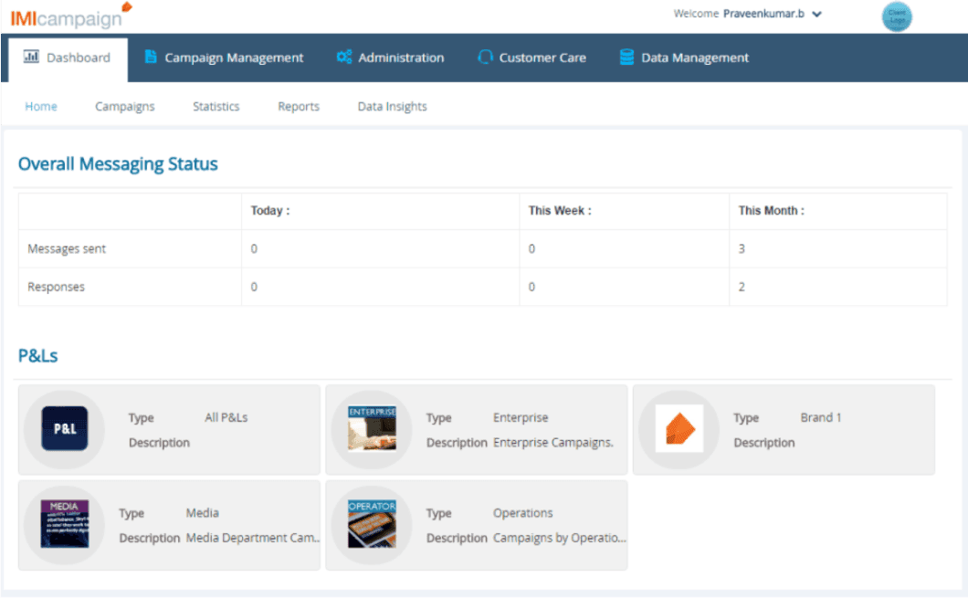
Existing dashboard — no clear performance metrics
After
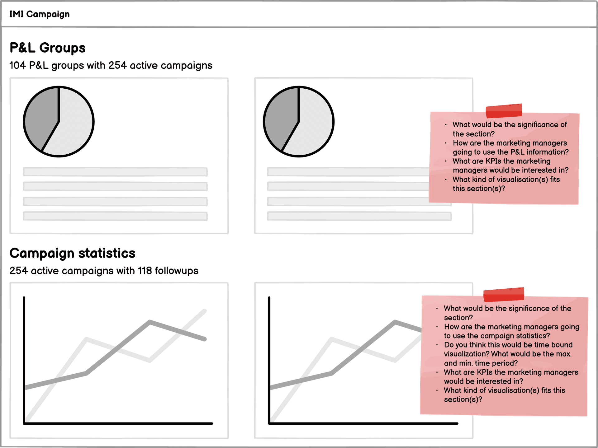
First iteration — block-based wireframes with stakeholders
To address the lack of clear performance metrics, we implemented a centralised dashboard as the landing page to provide immediate visibility into campaign health. The low-fidelity block diagrams facilitated a co-designing environment where stakeholders' domain expertise was integrated into every step — shifting conversation from generic templates to understanding how unique data models drive each visualisation.
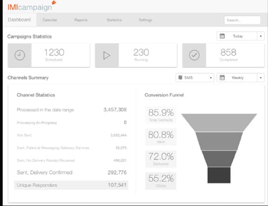
Second iteration — incorporating stakeholder feedback
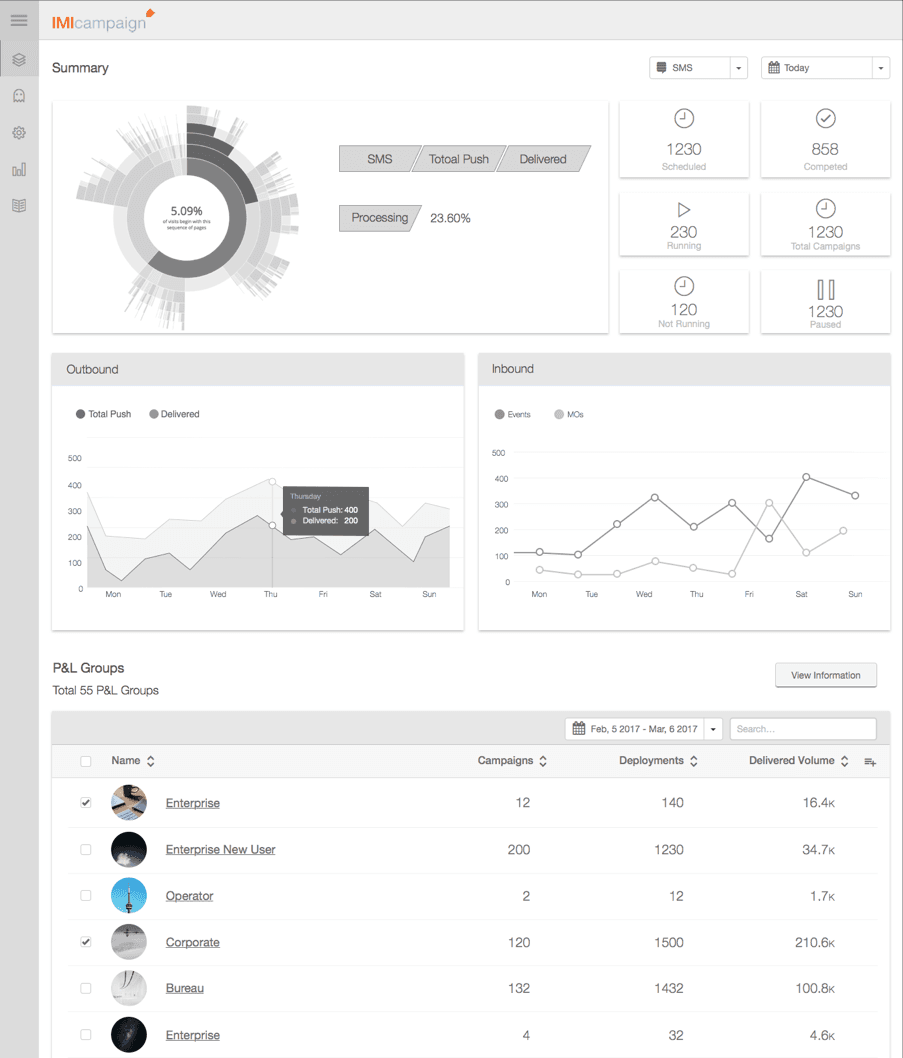
Third iteration — final dashboard direction
Analytics
Data Visualizations
Visualizing Composition and Proportions
Donut + Half Donut Charts Represent parts-of-a-whole relationships — quick snapshots of single-level distributions.
Sunburst Chart Powerful extension for Marketing Managers to visualise multi-level hierarchies in a single view.
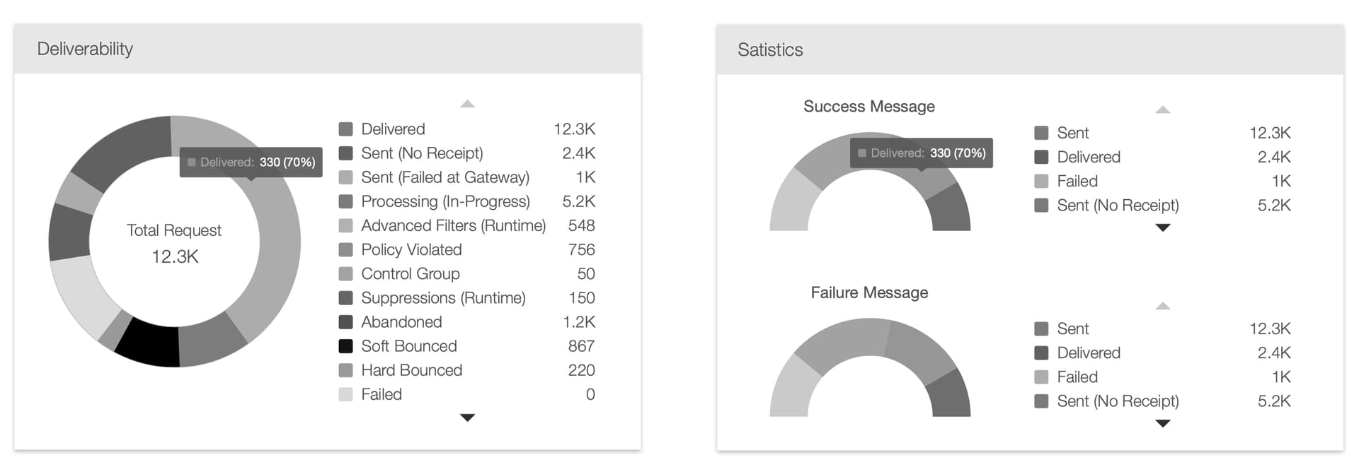
Analyzing Trends and Time-Series Comparisons
Line + Area Charts Track performance over time — compare engagement vs spend across date ranges.
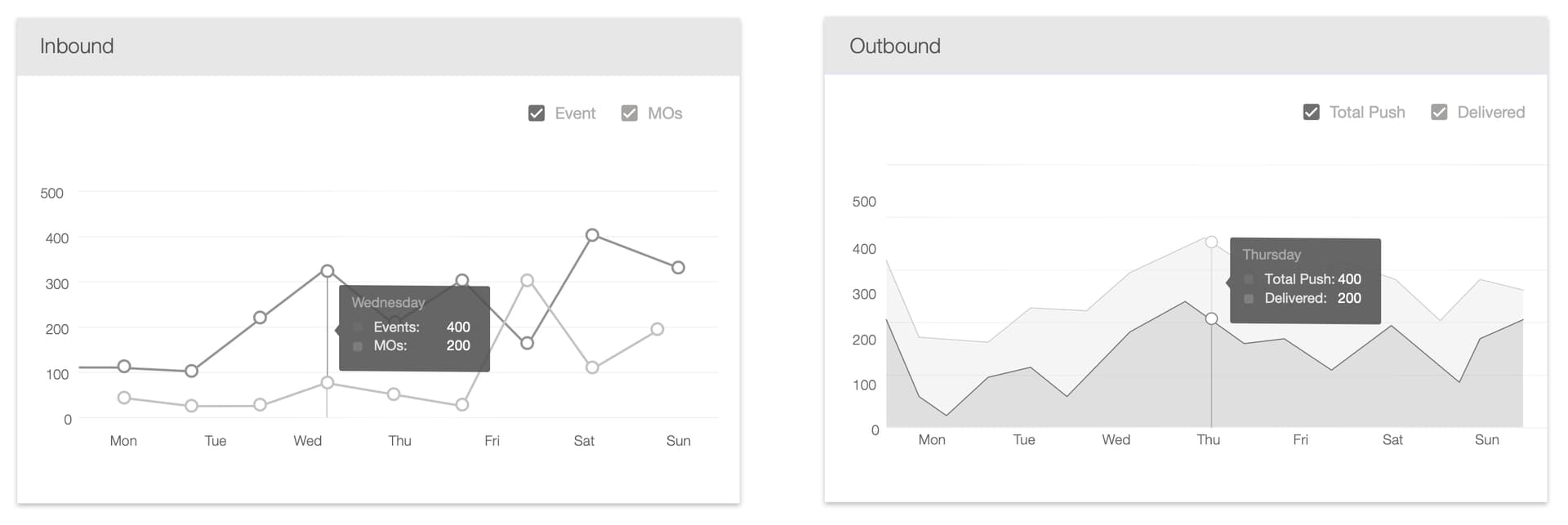
Identifying Bottlenecks with Stacked Comparison
Funnel Chart Visualises the conversion journey — highlights exactly where drop-offs occur in the marketing process.

Visual Campaign Builder
Visual Campaign Builder
We transitioned the core campaign logic from a restrictive "Who, What, When" form-based interface into a dynamic Visual Campaign Builder — achieved by deconstructing monolithic data entries into a flexible, node-based system.
Deconstructing Atomicity (Nodes)
Analysed existing campaign forms to identify their most basic functional components. Breaking these into Nodes transformed rigid input fields into discrete, modular units — each campaign action becomes an independent building block.
Defining Node Properties
For each node we designed a specific properties panel based on functional requirements — only surfacing relevant, actionable parameters whether setting an SMS message or defining a target audience.
The Interactive Canvas
Integrated nodes onto a centralised digital canvas. Mapping logical dependencies between nodes enabled users to visualise entire campaign flows — spatial representation allows complex branching journeys previously impossible in standard forms.
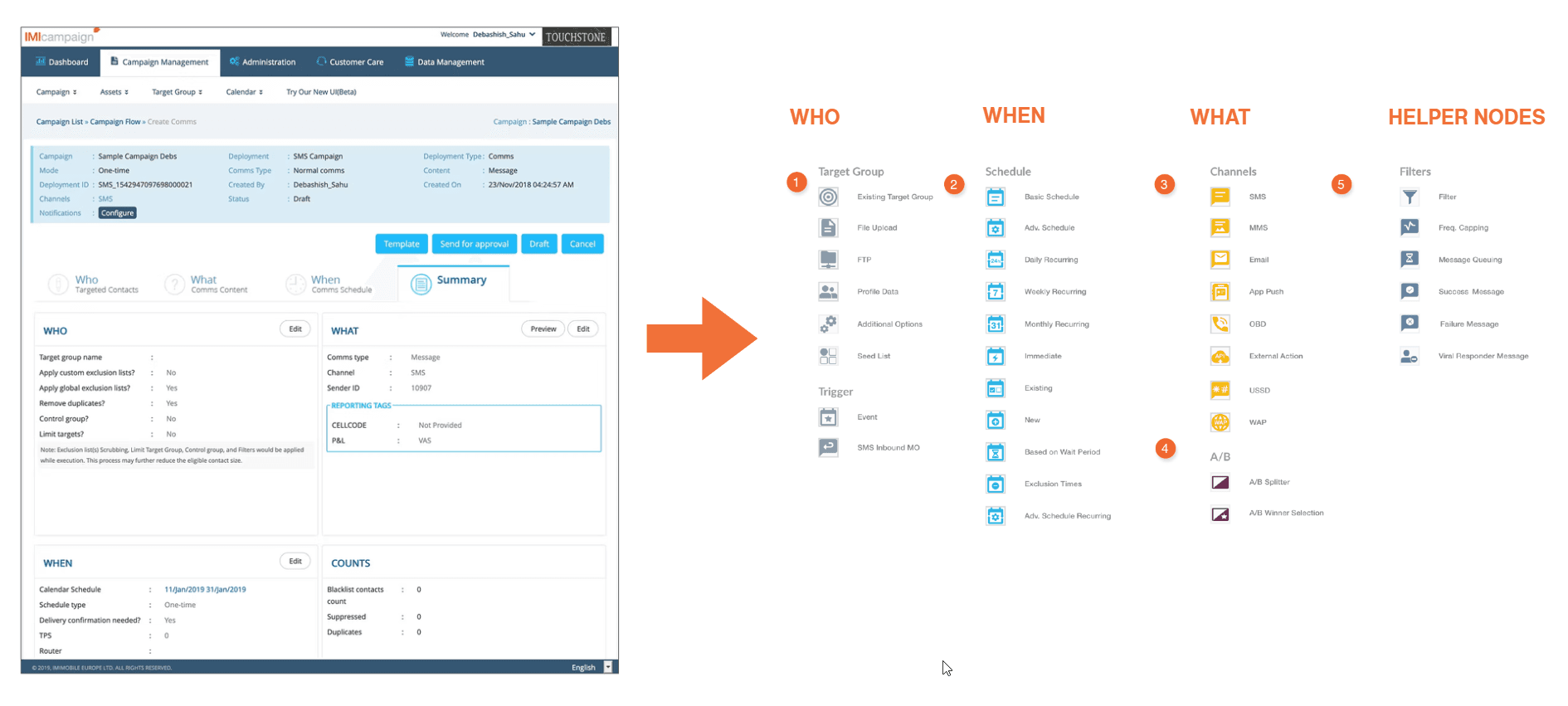
Node types — deconstructed from existing campaign forms
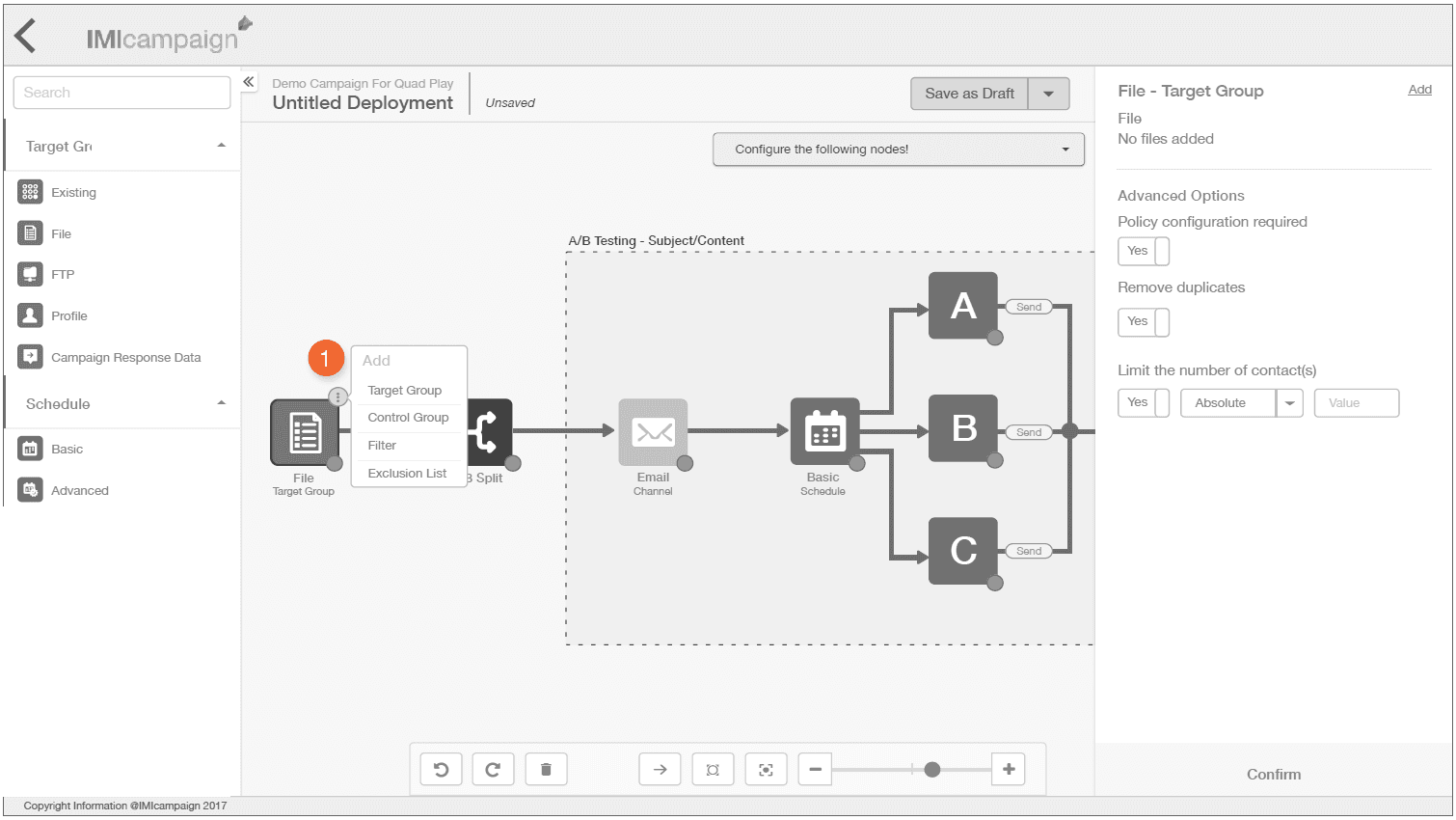
Node properties panel — contextual and action-specific
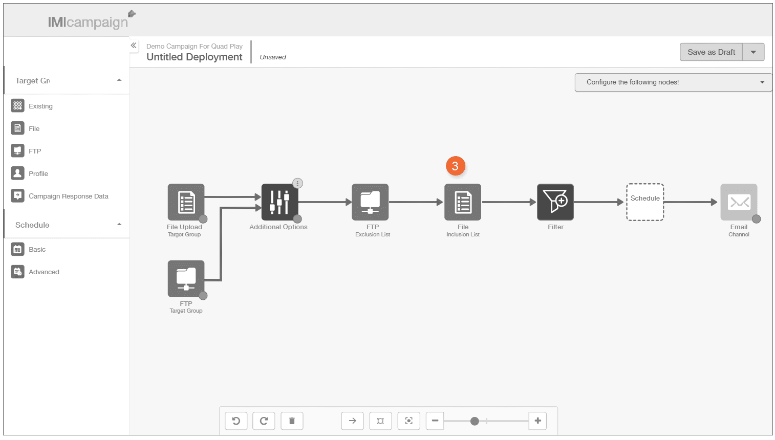
Node relationships — mapping campaign flow on canvas
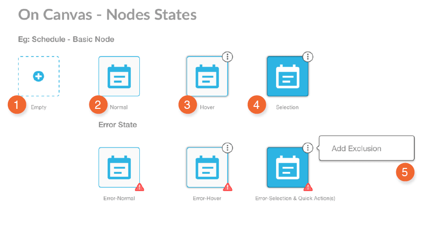
Node states — default, active, error, completed
To bridge the gap between a blank canvas and a finished journey, we introduced an intelligent Setup Wizard. Based on initial objectives — such as 'Promotion' or 'Instant Deployment' — the wizard generates a boilerplate template users can simply refine, significantly reducing 'blank page' fatigue.

Setup Wizard — objective-based templates to accelerate campaign creation
Listing Pages
Listing Pages (P&L, Campaigns & Deployments)
Hierarchical Data Architecture
Three-tier hierarchy: Campaign Groups → Primary Campaigns → Deployments. Nested listing — primary view shows high-level metrics, expandable inner table reveals granular deployment-level details.
Smart Truncation
Deployment names frequently 64–128 characters. Implemented middle-weighted ellipses — preserving both beginning and end of string (e.g. fifteen_charac...teen_characters) so users identify unique versions without breaking the layout.
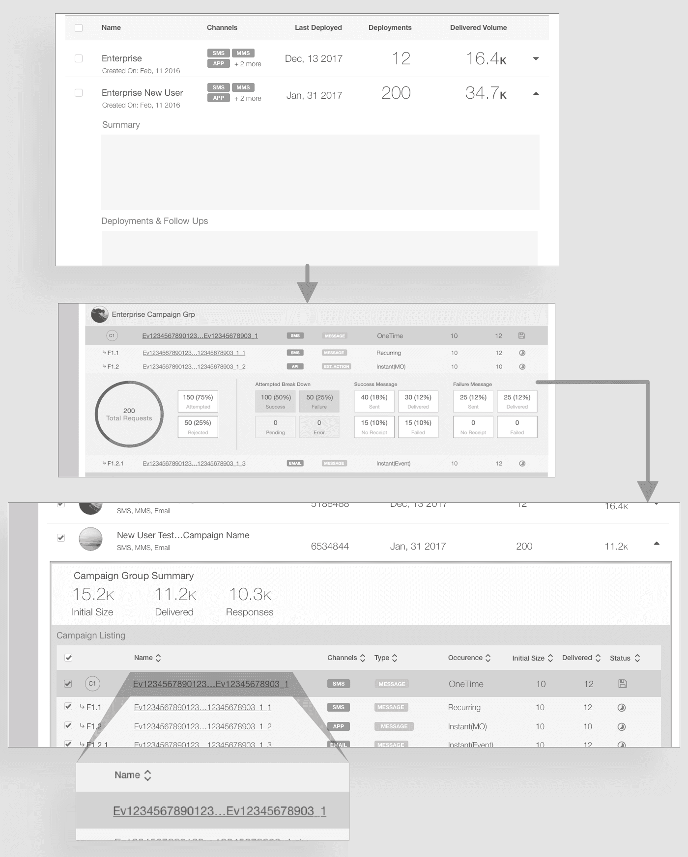
Listing page — three-tier hierarchy with nested drill-down and smart truncation
Final Designs
Dashboard: Monitoring Campaigns
Describes how a manager logs in and makes informed decisions using real-time graphs and tabular data to drill down to the most granular campaign detail.
Visual Campaign Builder: Provisioning Campaign
Shows how a manager creates a campaign using the visual builder tool — from blank canvas to fully mapped campaign journey.
Deliverables
Design Deliverables
"A good design is only as good as its documentation."
Wireframe Specification Document
Comprehensive technical blueprint detailing every UI component, data visualisation, and screen-level interaction. Defined the logic of the platform — specifying ideal data formats and expected outcomes for every complex table and chart.
Loading document…
Visual Specification Document
High-fidelity roadmap of visual treatment for every component, graph, and chart. Translated visual styles into precise technical values in pixels and percentages — developer-friendly, directly implementable in CSS.
Loading document…
Styleguide
Single source of truth unifying the platform's visual identity. Detailed exact colour palettes, shadow depths, and height/width constraints for all interface elements — ensuring pixel-perfect consistency across every module.
Loading document…
Testing and Evaluation
We conducted usability tests with 10 different users who drove, provisioned and executed campaigns on a daily basis. As users were key people within IMImobile's existing clientele situated in a different geographic location, we conducted remote usability test sessions considering both budget and project timeline.
User Feedback
Dashboard Feedback
Key statements from users & stakeholders
Each and every page were much richer in terms of graphs & data visualizations from the very first page of the Dashboard.
Full control over displayed information and ability to drill down to the most granular level on the basis of Hierarchy, Channels and Time.
Dynamic and relevant graphs directly downloadable and archived for client consumption — earlier they used to do a lot of excel work for graphs.
The navigation is very clean, nesting & hierarchy is much clearer — they were now sure about how and where certain information was located.
“Each and every page were much richer in terms of the graphs & data visualizations... full control over displayed information and ability to drill down.”— Campaign Manager · IMImobile
Visual Builder Feedback
Campaign Builder Feedback
Campaign Management — Visual Campaign Builder
New interaction experience with the canvas and draggable nodes is a most usable & wow factor.
Clear compartmentalisation of information in specific nodes with configurable properties, retaining the familiar Who, What & When connotation.
Ability to visualise campaigns and trace the node needing adjustment without digging through a long series of clickable forms/wizards.
Hidden menus and options now available through the click of respective node elements as overflow menu in the canvas.
“New interaction experience with the canvas and draggable nodes is a most usable & wow factor... Ability to visualise campaigns and trace the node which might need tweaking without digging through a long series of clickable forms.”— Campaign Manager · IMImobile
“The navigation is very clean, nesting & hierarchy is much clearer and takes away the need for searching through keyboards in most of the cases.”— Stakeholder · IMImobile
Quantified Business Impact
Time-to-Navigate
Reduced — users find information and complete tasks much faster
Campaign Creation
Faster — significant boost in operational efficiency for marketing teams
Hand-off Time
Reduced — streamlined collaboration between different teams and roles
The highly intuitive design significantly lowered the learning curve, empowering clients to transition from managed services to self-sufficient, in-house operations far more rapidly.
Marketing Positioning
Competitive Standing
The redesign completely transformed the product, elevating UX and feature set to compete with major industry players like Adobe Campaign Manager and Salesforce.
New Enterprise Clients
4–5 new enterprise clients including major telecommunications companies — O2 and Cingular UK — acquired post-launch.
Cisco Acquisition
~8 months post-launch, Cisco acquired IMImobile. The redesigned campaign tool was a key differentiator. The product still stands with the design work done.
Conclusion
What worked well
Building stakeholder trust first Rather than insisting on direct user research immediately, demonstrated value through internal collaboration — this built credibility that eventually opened doors to actual customers.
Advocating for fundamental change The visual builder wasn't the safe choice — it required rebuilding core functionality. But research supported that optimising the existing form-based system would only marginally improve a fundamentally flawed paradigm.
Designing for handoff from day one Knowing the engagement was temporary, prioritised documentation and systematic design decisions that could survive and scale without us.
Maintaining the 'Who, What, When' mental model Rather than inventing entirely new concepts, preserved familiar terminology while transforming the interaction paradigm — reducing learning curve for existing users.
Key learnings
Complex enterprise tools benefit from visual paradigms When users already think in flowcharts and diagrams, forcing them into linear forms creates unnecessary cognitive translation — meeting mental models reduces training and errors.
Senior design leadership means advocacy Impact often comes from making the case for the right solution, not just executing what's requested. Research-grounded advocacy for the visual builder created outsized business value.
Design systems are force multipliers The investment in systematic documentation paid dividends well beyond the engagement, enabling consistent evolution and expansion to new products.